This guide covers how to customize and create themes using the In-App Theme Creator in Hyper Bridge:
- Build, preview, and customize colors, geometric masks, call styles, and engine behaviors directly on your device.
- Export your creations or import themes shared by the community.
See the Theme Packaging Specification (.hbr) in the Advanced & Developer documentation.
Visual Theme Creator (In-App)#
Hyper Bridge 0.6.0 includes a full-featured Visual Theme Creator (ThemeCreatorScreen). You can build, preview, edit, and apply beautiful custom island themes directly on your phone without touching JSON or ZIP files.
flowchart TD
    Hub["Design Hub"] --> Create["Create Theme / Edit Theme"]
    Create --> LivePrev["Interactive Island Preview\n(Accept/Decline, App Colors, Masks)"]
    Create --> Sections["Theme Creator Sub-Menus"]

    Sections --> SecColors["🎨 Colors & Color Mode\nHex picker, App Icon color sampling"]
    Sections --> SecIcons["📐 Icons & Shapes\nCircle, Squircle, Cookie, Clover, Padding"]
    Sections --> SecCalls["📞 Call Controls\nAnswer & Decline colors, shapes, custom icons"]
    Sections --> SecBeh["⚡ Engine & Behavior\nFloat duration, timeout, Live Update engine"]
    Sections --> SecNav["🧭 Navigation & Reply\nTurn-by-turn colors, inline reply appearance"]
    Sections --> SecActions["🔘 Default Actions\nReply, Archive button styles & icons"]
    Sections --> SecApps["📱 App-Specific Overrides\nPer-app highlight & button customizations"]
1. Accessing Theme Management#
Open Design Hub → tap the Themes & Styles Bento card:
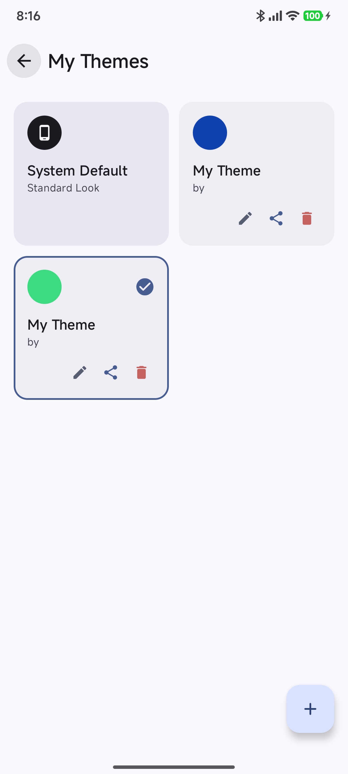
From here you can:
- Switch Active Theme: Tap any theme card to activate it immediately.
- Manage Custom Themes: Tap the Edit (Pencil) icon to modify an existing theme, Share to export as an
.hbrbundle, or Trash to delete it. - Add New Theme: Tap the
+(Floating Action Button) in the bottom right corner:
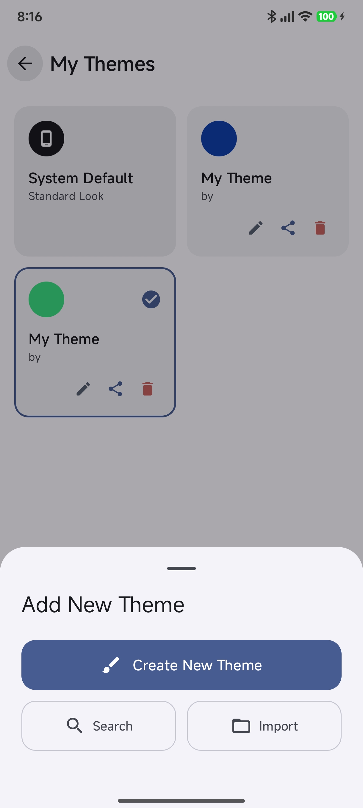
Choose Create New Theme to launch the visual studio, Import to load a local .hbr/.htheme archive, or Search to browse community creations.
2. The Theme Creator Studio Overview#
When you create or edit a theme, the Theme Creator Studio (ThemeCreatorScreen) opens with an interactive live canvas at the top:
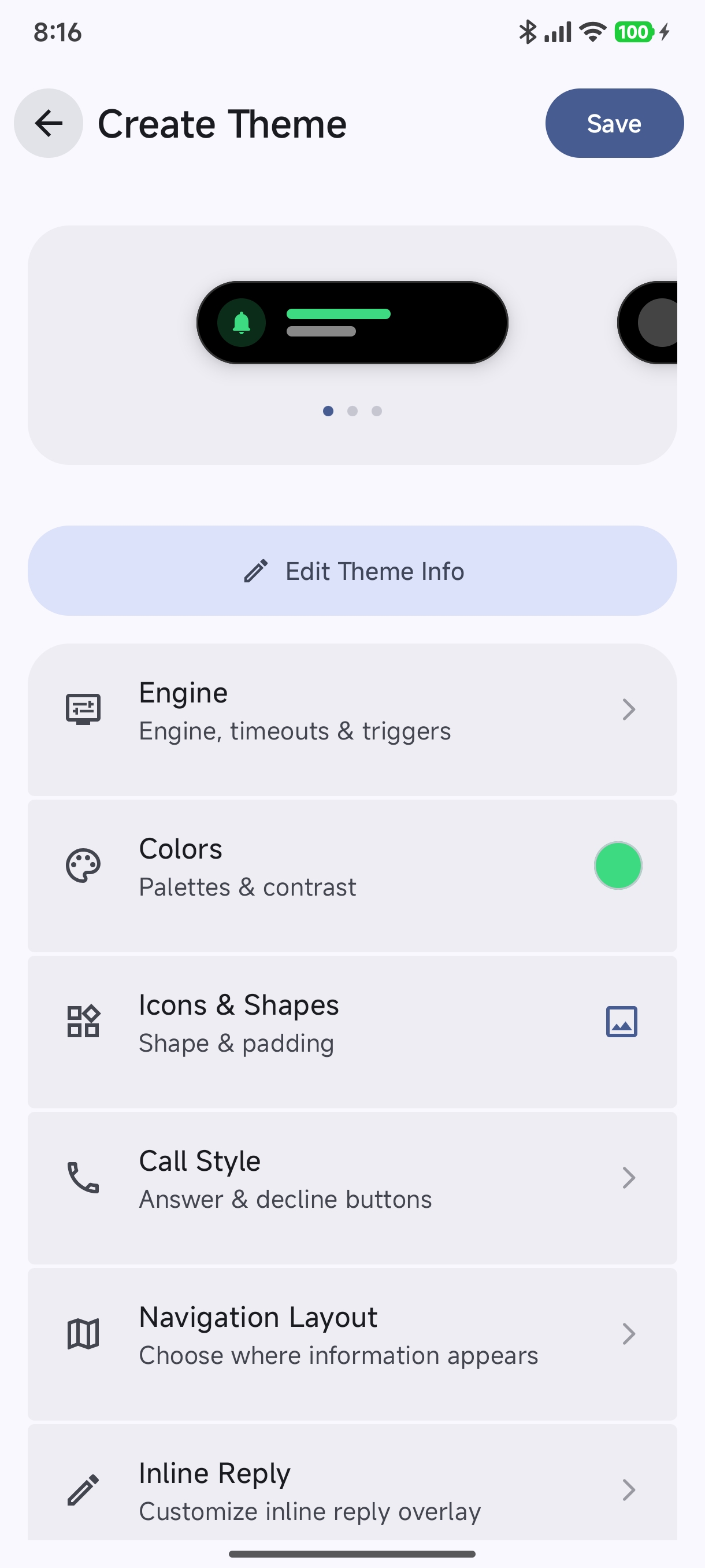
Theme Info & Metadata#
Tap Edit Theme Info to brand your creation:
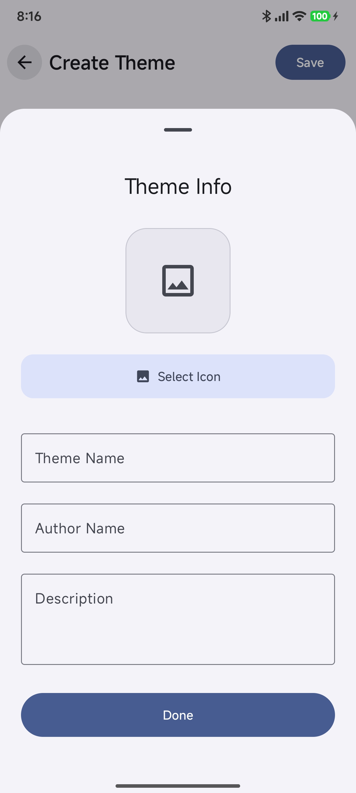
- Select Icon: Pick an emblem or custom artwork for your theme card.
- Theme Name & Author Name: Give your theme a distinctive identity.
- Description: Add release notes or styling tips.
3. Step-by-Step Theme Modules#
The creator organizes theme properties into modular, focused subscreens:
⚡ Behavior & Triggers (CreatorRoute.BEHAVIOR_MENU)#
Configure how the notification engine treats this theme:
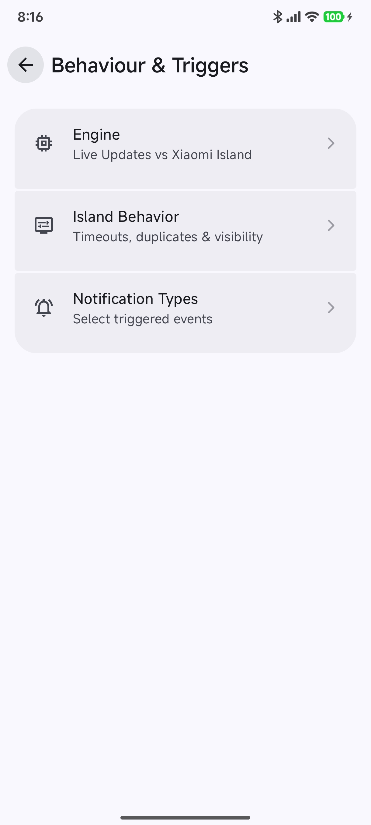
- Engine: Switch between Live Updates (Custom Island Engine) and Native Xiaomi Live Updates.
- Island Behavior: Fine-tune auto-dismiss durations, duplicate handling, and lock screen visibility.
- Notification Types: Choose which event categories trigger islands for this theme.
🎨 Colors & Color Mode (CreatorRoute.COLORS)#
Define the visual color palette across your island:
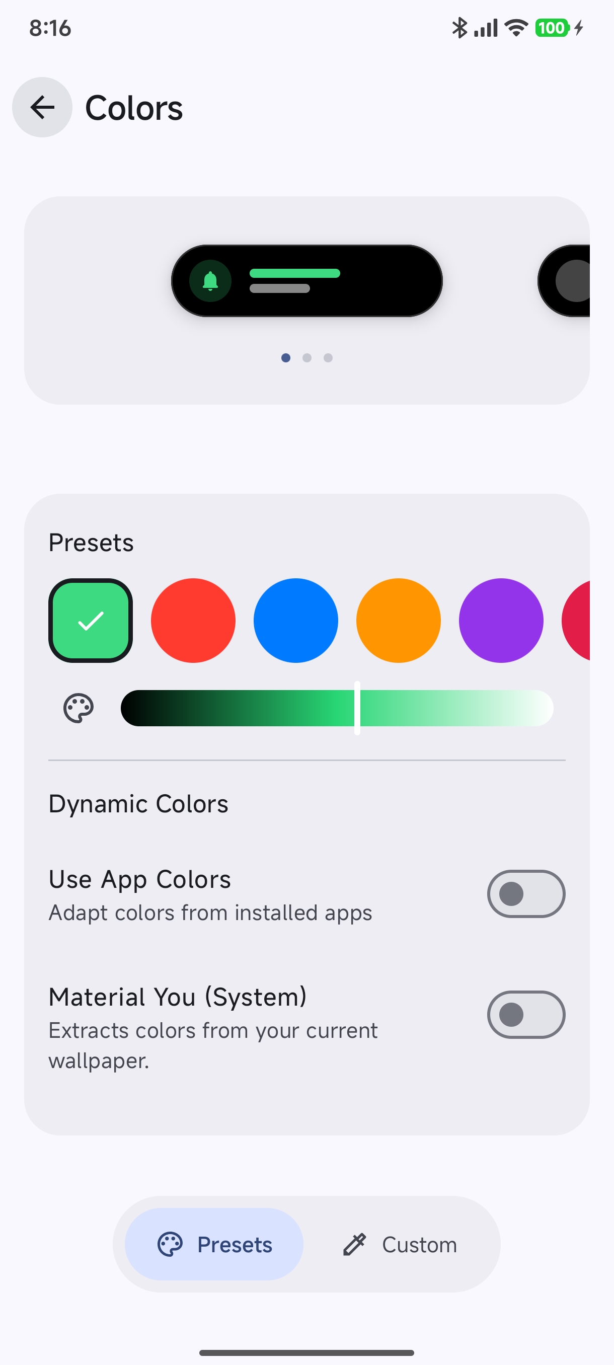
- Preset Colors: Tap quick accent swatches (Green, Red, Blue, Orange, Purple).
- Dynamic Colors:
- Use App Colors: Automatically extracts and applies the dominant color from each notification app’s icon for a customized look.
- Material You (System): Extracts tonal palettes directly from your Android wallpaper.
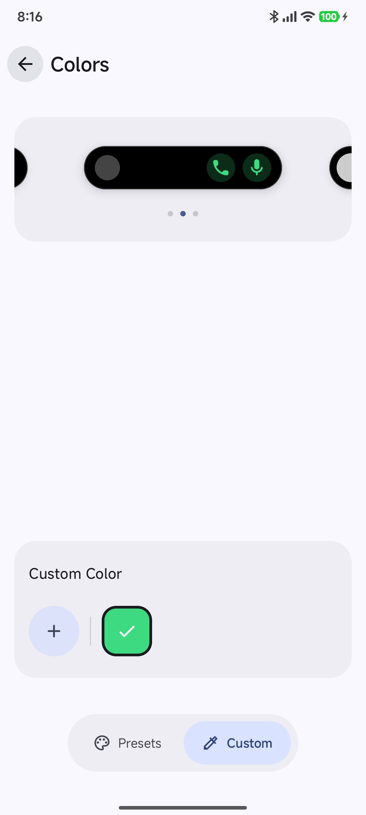
- Custom Color Picker: Tap the Custom tab to choose any precise hex code:
📐 Icons & Shapes (CreatorRoute.ICONS)#
Style the geometric framing and proportions of notification avatars and status indicators:
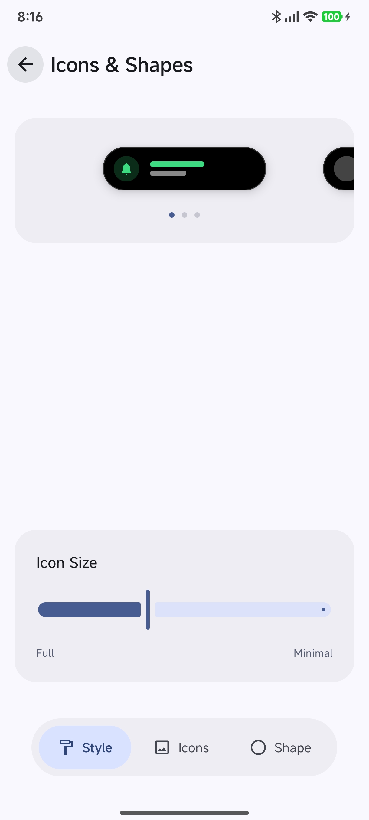
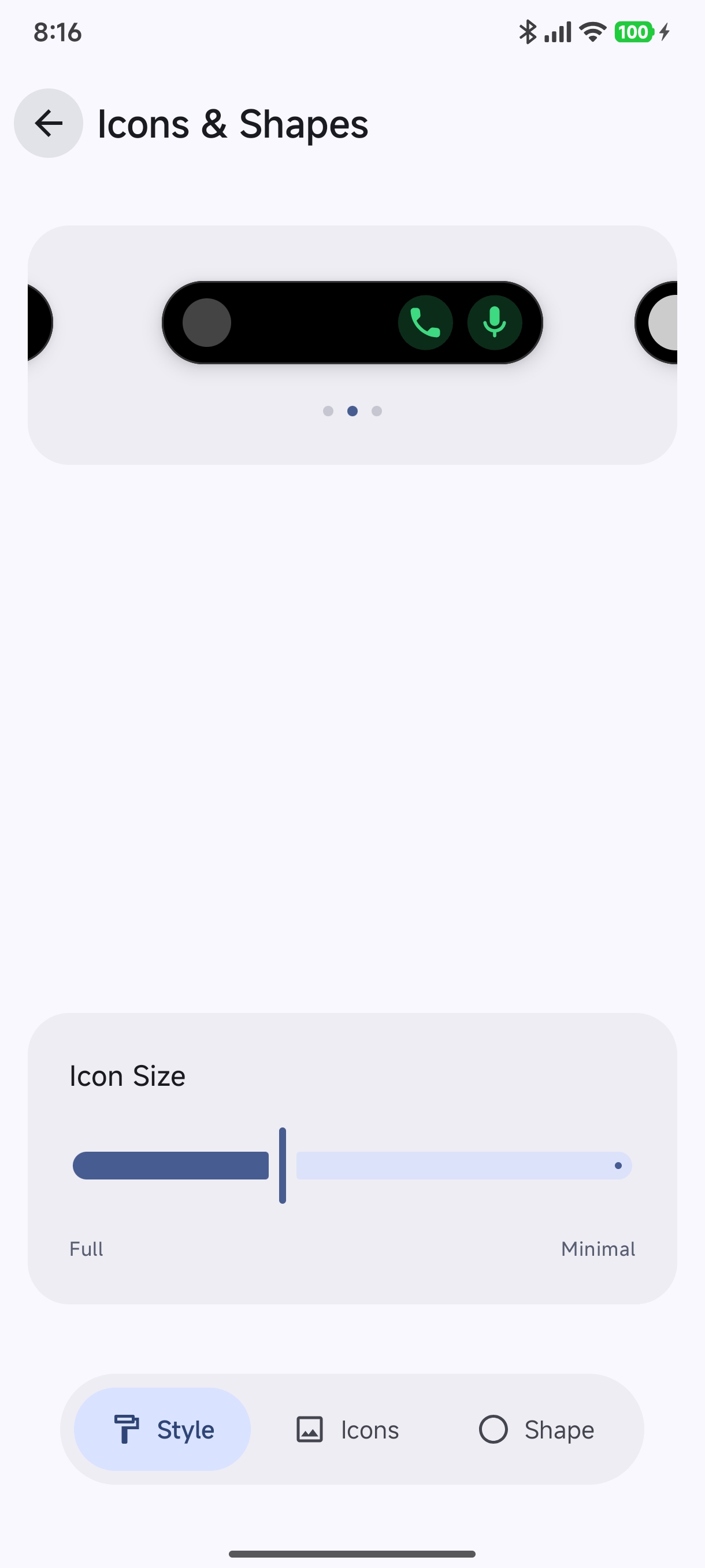
- Icon Size Slider: Scale notification icons between full-bleed and compact minimalism.
- Live State Previews: Swipe horizontally on the preview card at the top to see your changes across notifications, calls, and media:
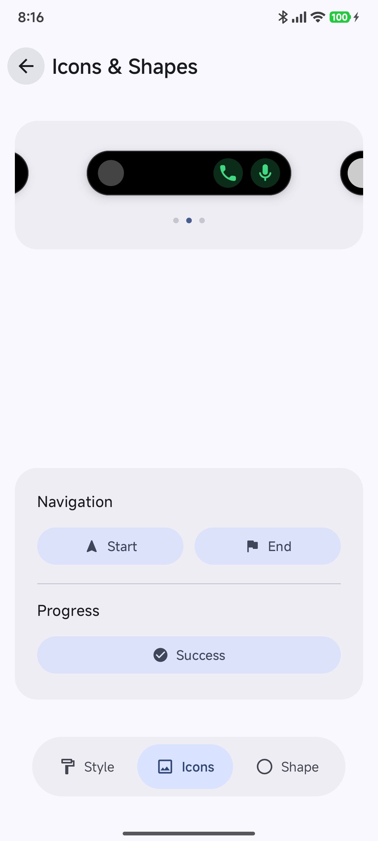
- Navigation & Progress Icons: Choose custom vector glyphs for turn-by-turn guidance and completion badges:
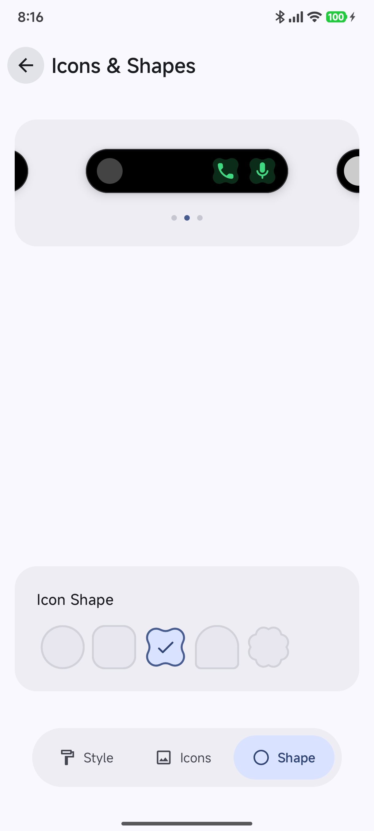
- Geometric Mask Picker: Apply custom corner masks to all icons:
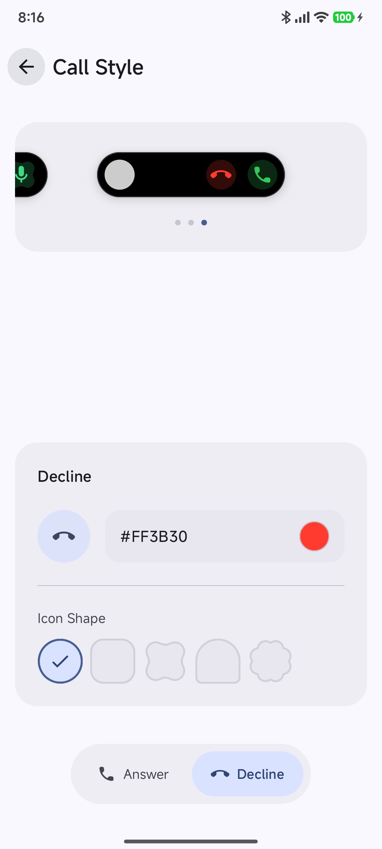
📞 Call Controls Style (CreatorRoute.CALLS)#
Customize incoming and ongoing phone call cards:
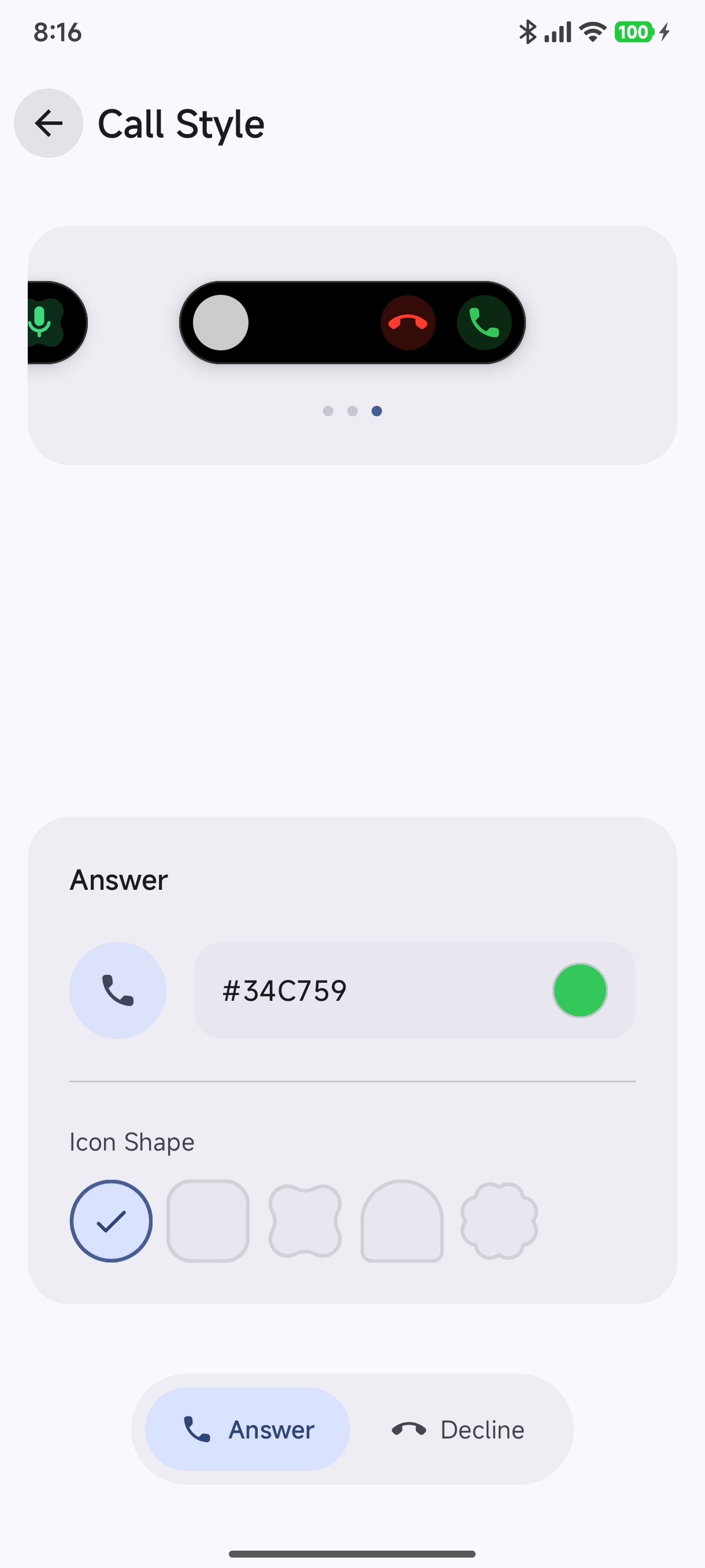
- Answer Button: Configure custom hex colors (default
#34C759) and geometric masks. - Decline Button: Configure end-call accents (default
#FF3B30) and button shapes:
🧭 Navigation Layout (CreatorRoute.NAVIGATION)#
Fine-tune turn-by-turn GPS heads-up islands:
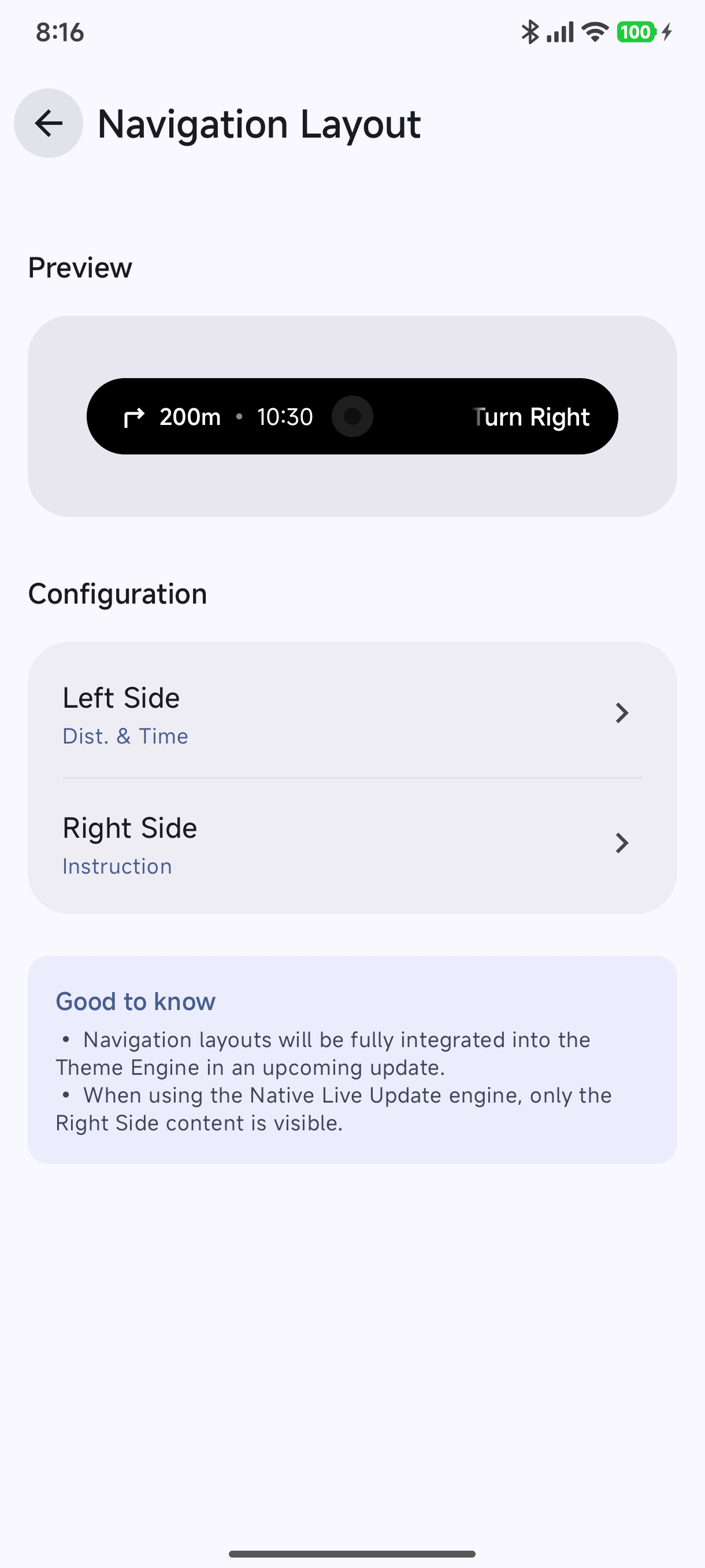
- Left Side: Distance & Remaining Time.
- Right Side: Maneuver instruction (e.g., Turn Right).
- Note: In the Native Live Update engine, right-side content is prioritized to maintain status bar alignment.
🔘 Global Actions & Quick Buttons (CreatorRoute.ACTIONS)#
Configure smart action buttons attached to notifications (such as Reply, Archive, Like, Mark as Read):
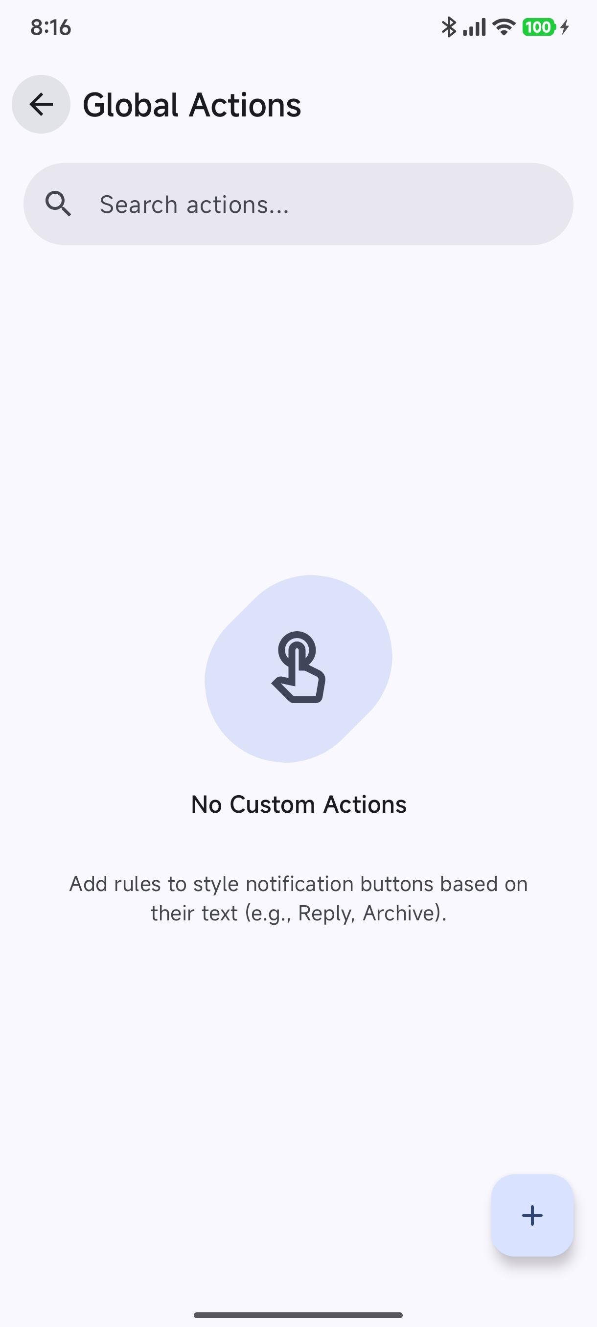
Tap the + (Add Action) button to create keyword matching rules:
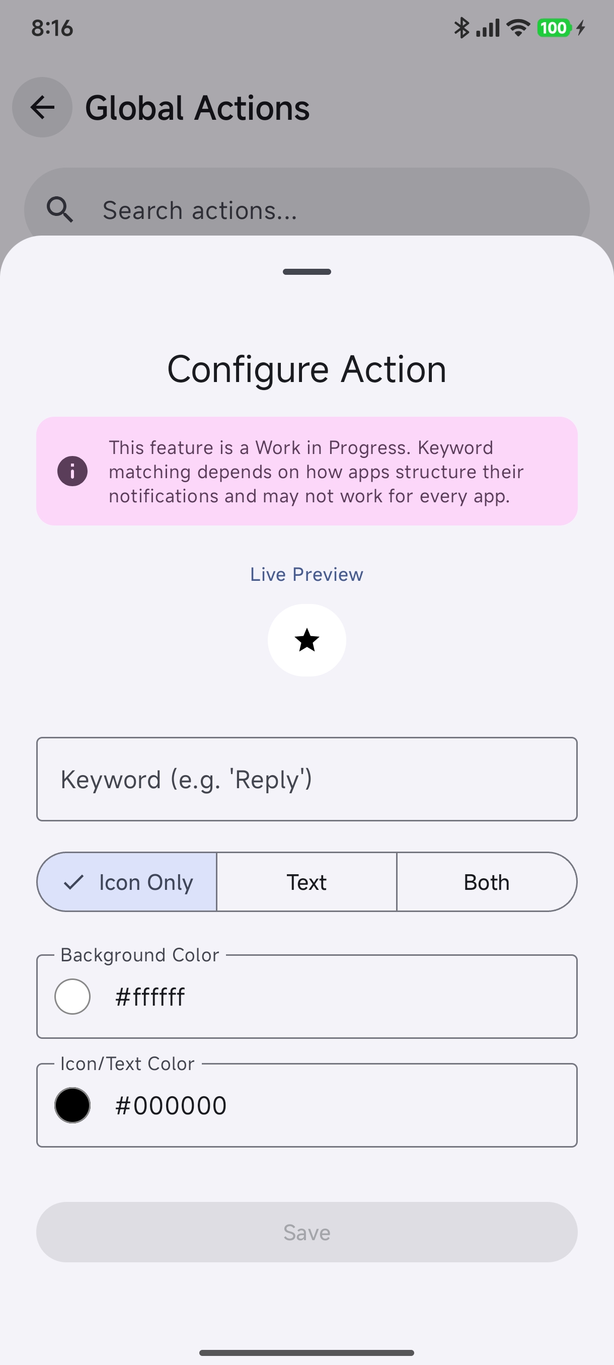
- Keyword Matching: Enter keywords (e.g.
'Reply','Archive','Skip'). - Display Mode: Choose between Icon Only, Text, or Both.
- Colors: Set custom button background and text/icon contrast colors.
📱 Per-App Custom Overrides (CreatorRoute.APPS)#
Override theme rules for specific individual applications:
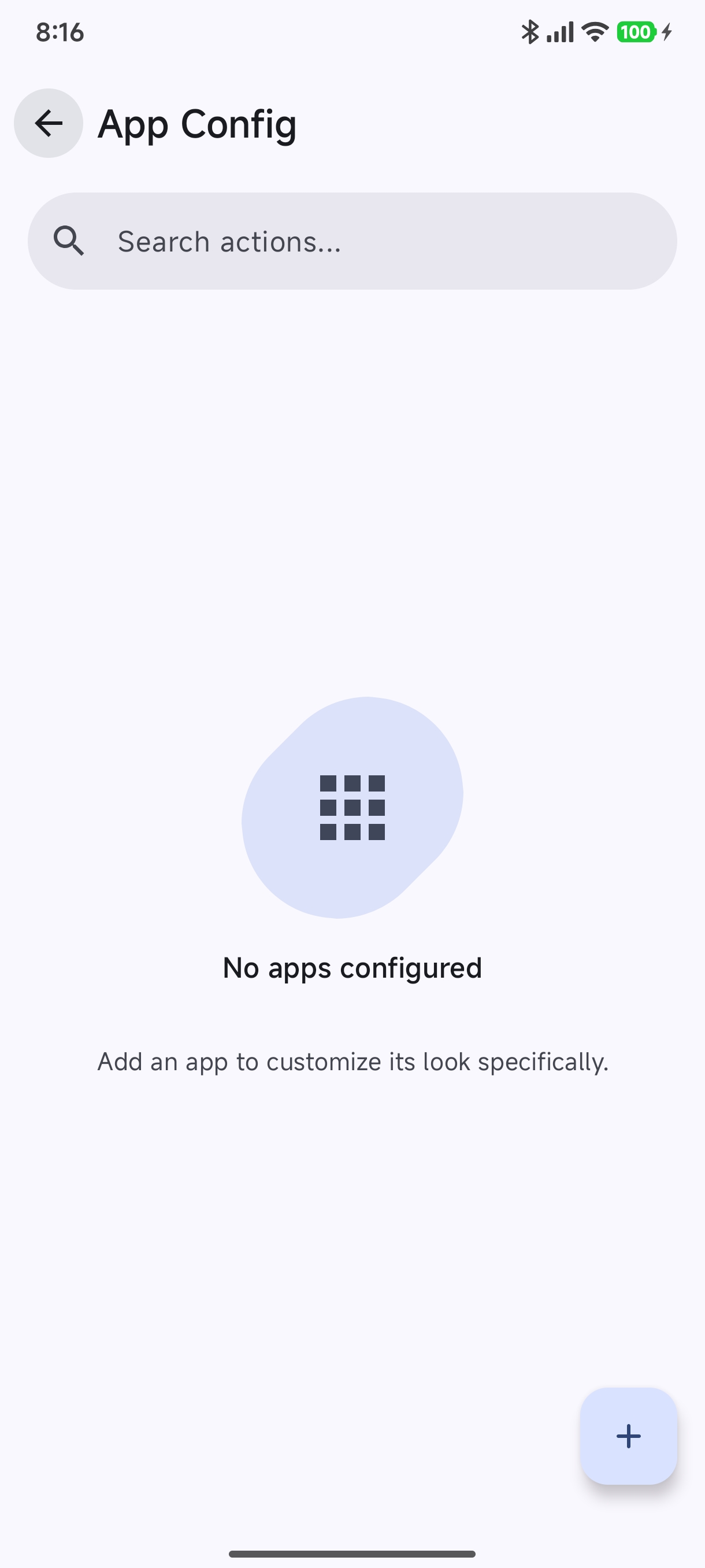
Tap + to select an app from your device:
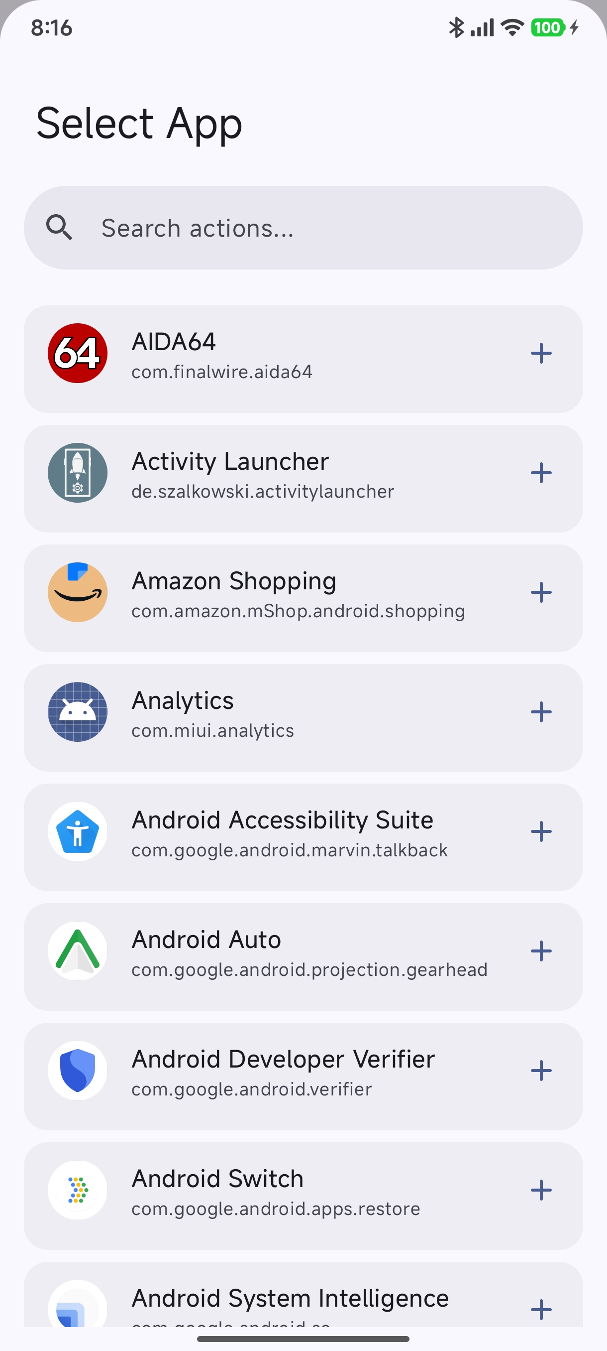
You can assign unique highlight colors, distinct geometric shapes, or special button layouts for specific apps (e.g., WhatsApp in emerald green, Spotify in neon green, YouTube Music in crimson).
4. Saving & Applying Your Theme#
- Tap the Save button in the top-right corner of the studio.
- In the dialog:
- Save & Apply: Immediately activates your new theme as the default system style.
- Save Only: Saves the theme to your library without applying it.
- Your theme is saved locally and can be exported as an
.hbrpackage at any time!
Exporting, Importing & Sharing Themes#
Hyper Bridge makes it easy to back up, share, and import themes without touching code:
Exporting an In-App Theme#
- Navigate to Design Hub → Themes & Styles.
- Tap the menu (⋮) or the Export icon on any custom theme card.
- Choose a destination folder using Android’s file picker. Hyper Bridge generates an
.hbrtheme package containing all your colors, button rules, and bundled translators.
Importing a Community Theme#
- Download any
.hbror.hthemefile from the community, Discord, Telegram, or GitHub. - In Hyper Bridge, go to Design Hub → Themes & Styles and tap Import Theme in the top bar.
- Select your
.hbrfile. Hyper Bridge will preview the theme palette and install it into your library with one tap.
Packaging Themes for Distribution (Developers)#
If you are an icon pack developer, designer, or Android modder interested in:
- Manually creating
.hbr/.hthemeZIP packages with custom icons, - Bundling custom
.htranstranslators inside your theme, - Triggering 1-tap theme installation from your companion Android app via
com.d4viddf.hyperbridge.APPLY_THEMEintents,
Please refer to the dedicated Theme Packaging Specification (.hbr) in the Advanced & Developer documentation.
Next Steps#
- Browse the official 10 Xiaomi Island Templates to see how themes render across delivery, music, and boarding pass cards.
- Add live home-screen widgets into your islands with the System Widgets Guide.
- Create custom notification rules with the Custom Translators Guide.